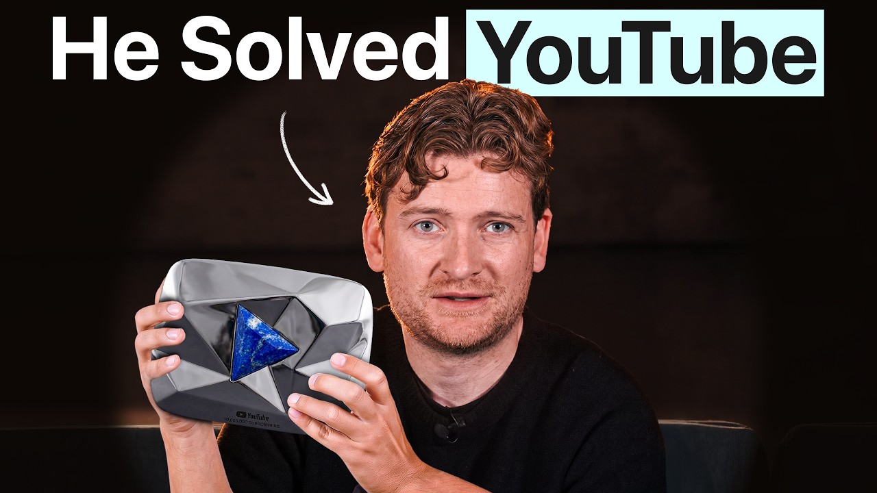
Paddy Galloway slid an iPad across the table to Sweat Equity and asked a simple question: which thumbnail would make you click if you had thirty seconds left before you put your phone down for the night? The answer to that question, it turns out, is the foundation of a strategy that has driven more than 50 billion organic views on YouTube long-form content. For anyone who has ever posted a video and watched it flatline at a few hundred views, the gap between making good content and making content that actually gets watched is the gap Galloway has spent his career engineering closed.
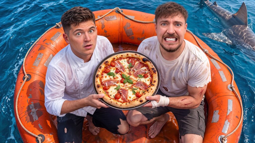
Galloway is the consultant behind some of the largest YouTube channels ( IE MrBeast 😉 ) and brand accounts in the world, driving over 10 billion views a year for clients ranging from Red Bull to the Philadelphia Eagles. His framework is less about production quality and almost entirely about packaging, and he is blunt about why that shocks people: ‘I often say it is 50% of the game, and that shocks people because you think YouTube is a video platform. People think you make videos that people watch. But I think about it as: you make title thumbnails that people click, and videos that people watch. It is 50/50.’
The thumbnail rule that changed everything
The core of Galloway’s packaging philosophy is a concept he calls ‘paused in action.’ A great thumbnail does not show a posed, smiling face looking at the camera. It freezes a moment mid-motion, so that clicking the video feels like pressing play on something already happening. He pointed to a Red Bull collaboration showing an F1 car and a drone side by side, with leading lines stretching toward a track in the distance. Simple, bright against a dark-mode feed, and impossible to ignore without clicking.
He brought up a video his team made with Noah Kagan where the thumbnail showed someone answering a door looking uncertain, like they were about to say no. That person was not in the video at all. She was a neighbor who agreed to pose for thirty seconds. The video reached somewhere between 5 and 6 million views. One commenter noticed. Nobody else did.
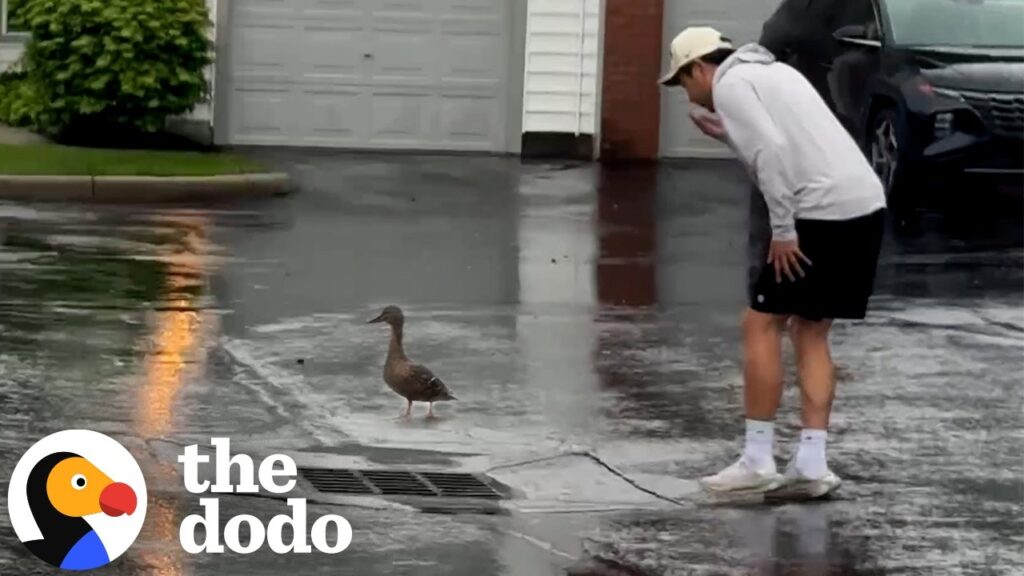
For text, Galloway caps it at four or five short words and cites his favorite example without hesitation: a thumbnail showing a dodo bird with the words ‘You’ve been lied to.’ He later used the exact same line for a personal finance creator’s video about why he does not own a house as a multi-millionaire. The frame transferred perfectly across completely unrelated niches because the emotional mechanism, the desire to uncover a hidden truth, is universal.
On thumbnail testing, he draws a hard line with every client: a minimum of three thumbnails per video, tested against each other at launch. For some clients, that number reaches 20 or 30 per video. He has personally tested 50 entirely distinct variations, not the same image with different text, but 50 unique creative concepts, for a single upload.
Why a 20% better thumbnail can produce a 4,000% better result
One of the clearest illustrations Galloway offered involved a creator whose video was getting around 1,000 views per day. His team brainstormed a new thumbnail. If you showed both options to people on the street, most would say the new one was maybe 20 to 30 percent better. The video went from 1,000 views a day to 40,000 views a day. The algorithm does not respond linearly to improvement. A small strategic change can trigger a multiplier that most creators systematically underestimate because human intuition expects proportional returns.
This is also why he pushes clients to stop optimizing purely for consistency and start building in deliberate experiments. His internal target is roughly one-third of content drawing from what is already working internally, one-third from external patterns observed across adjacent niches, and one-third from original concepts no one has tried. He told one client who was reliably hitting 200,000 views per video: ‘I want more 50s and 500s. I do not want to just hit 200,000 every time.’ The 50,000-view video is often what comes right before the 500,000-view video.
For video structure, his intro framework runs three steps: deliver on the click within the first 5 to 10 seconds so the viewer gets confirmation they landed in the right place, create a specific intrigue that makes the viewer lean forward (‘he discovered something in October of 2017 that changed everything’ does more work than ‘five tips for growing your channel’), and then flow seamlessly into the content without a hard transition. The moment a creator says ‘all right, let’s get into it,’ they have already lost the thread.
A thumbnail with a person who was never in the video
The neighbor who posed in Noah Kagan’s doorway thumbnail is still out there, presumably unbothered, having contributed to one of the highest-viewed business videos in long-form YouTube history without appearing in a single frame of it.
Galloway’s accelerator runs three cohorts a year, roughly 100 students each, eight weeks of the same playbook he uses with clients who invest tens of thousands of dollars per video into getting the packaging exactly right. For everyone else, the advice is free, and it fits on a thumbnail: keep it simple, make it feel paused, and build in the reason to click before you build anything else.