After five years of reviewing thousands of thumbnails from hundreds of creators, Aprilynne Alter kept writing the same notes. Not variations on a theme but the exact same feedback, handed to beginners and veterans alike, cohort after cohort. That repetition became the brief for a 10-minute breakdown that addresses what she calls the 90% problem: the overwhelming majority of thumbnail struggles trace back to the same small cluster of fixable mistakes, and most creators have no idea they are making them.
The half your thumbnail is already invisible problem
The first note Alter now gives more than any other is one that most creators have never considered: make your thumbnail TV-friendly. YouTube TV viewership in the United States has surpassed mobile as the primary device people use to watch, and the TV interface does something quietly damaging to thumbnails. On both the homepage and the suggested panel, only the top portion of a recommended video is visible. A viewer has to press down on their remote to reveal the full thumbnail and title. If a creator’s most important visual elements live in the bottom half of their design, TV viewers see nothing worth pressing down for.
Alter’s fix is what she calls the 50% test: cover the bottom half of any thumbnail and ask whether what remains gives a viewer enough reason to keep going. If the answer is no, moving key elements upward or adding text to the top third of the frame usually solves it.
The TV problem connects directly to her second note. Titles are shrinking relative to thumbnails across every YouTube interface, and the result is that viewers now browse thumbnails alone, reading a title only as a deliberate, active choice. That shift means a thumbnail can no longer lean on an interesting title to close the deal. It has to generate genuine interest by itself. Alter’s instruction is to lead the design process not with ‘what should I show’ but with ‘what do I want my viewer to wonder and to feel.’ Questions and emotions, she argues, beat relevance every time when it comes to clicks.
Why starting from scratch is the most expensive habit in YouTube
The third note is the one Alter says has the biggest single impact on clickability, and it still catches creators off guard: stop starting from scratch. She recommends gathering 10 to 15 references before designing anything, pulling from five specific sources. Those sources include a creator’s own past videos that overperformed their channel average, other channels’ outlier videos, channels that make a similar format but cover a different subject, saved thumbnails from personal browsing, and off-platform sources like billboards, album covers, and film title cards.
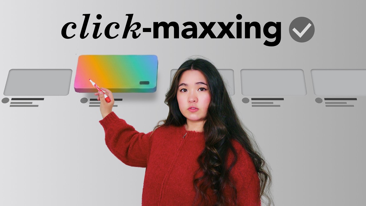
For her own thumbnail on this piece, she found a frame from a TV show intro that evoked a strong feeling of novelty. Working through the mechanism with some help from Claude, she identified that the feeling came from taking traditionally flat, 2D elements and rendering them three-dimensional. She applied that exact transfer to her own subject: YouTube thumbnails are traditionally 2D, so what would one look like if it appeared 3D instead? That question became the foundation for the design she ended up testing.
For thumbnails that need improvement right now rather than through a full process change, Alter points to three smaller fixes. Remove anything that is not actively helping: a realistic swimming pool full of lane dividers might be accurate, but the bars pull attention away from the subject. Make the main character unmistakable, the first thing a viewer’s eye reaches. And spend five extra minutes writing alternate versions of any thumbnail text before committing, because small word changes can produce measurable performance differences.
As Alter put it: ‘When it comes to thumbnails, even tiny tweaks can make a huge difference.’
The TV show frame that started as nothing
A frame from a TV show intro sits somewhere in Alter’s reference folder, pulled not because it matched any video topic but because it produced a strong feeling she could not immediately name. It prompted no specific question. It was simply novel.
The six notes she walked through in 10 minutes were built, in part, around understanding why a single frame from an unrelated show could do more for a thumbnail than a dozen directly relevant images.
Five years of repeated feedback and one unexplained feeling turned into the same advice she keeps handing out, still, to hundreds of creators: the thumbnail you worked so hard to make is only as powerful as the half your viewer can actually see.